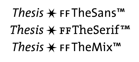
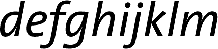
ThesisTMThat is (3 x 8 x 6), a total of 144 different fonts, each with all character positions filled, each fully kerned, none using Adobe standard encoding (so all symbol characters have been specially designed for each weight and form), and with true italics (drawn, not sloped roman). The italic forms are one of the most distinctive aspects of this family. Study of other low-contrast typeface designs shows that the italics are often little more than cleaned-up sloped forms. Not the case with Thesis: the italics stand on their own as unique letterforms, while perfectly complementing the Thesis roman forms.
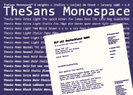
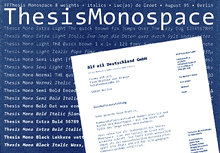
TheSans MonospaceTMEight weights and italics. It started as a face to print PostScript code and it appears to function very well as a correspondency typeface. Hand-hinted and hand-edited bitmaps make TheSansMono the ideal Monospaced font for your web browser.
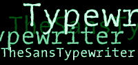
TheSans TypewriterTMTheSansTypeWriter is developped to meet the problems of the ever sharpening laserprinters in corporate environments. A regular typeface in 600 dpi is too smooth and loses the personal touch. TheSansTypeWriter is the roughened version of TheSansMono 12 Pitch. |
|